Landing pages are the linchpins of your sales funnel. Not only are they the driving force for generating new leads and sales, but they also have a direct impact on your Google Ads quality score.
So why does this quality score matter?
Well, a higher score increases the chances of your ads being displayed and reduces your cost per click (CPC). This helps your business attract more customers and pay less in advertising fees.
Sounds great, right?
But many businesses are sending their paid traffic to low-quality landing pages and leaving money on the table.
Industry research finds that:
- 77% of landing pages are home pages.
- Only 50% of landing pages are optimised for mobile.
- Targeting and testing landing pages can boost conversions by up to 300%
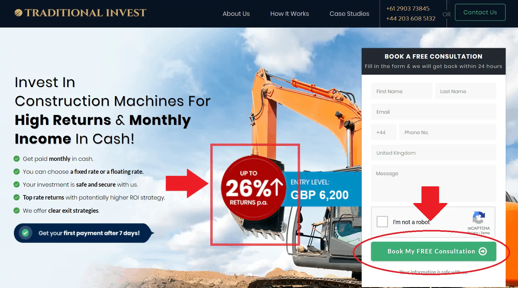
Now, you might be wondering how to tell if your landing page is “high quality” or not. That’s why we want to share this one from Traditional Invest with you.
They’ve used 7 key ingredients to make investing in construction machinery sound sexy – and even safe.
Here’s how they did it.
1. CTAs Above and Below the Fold
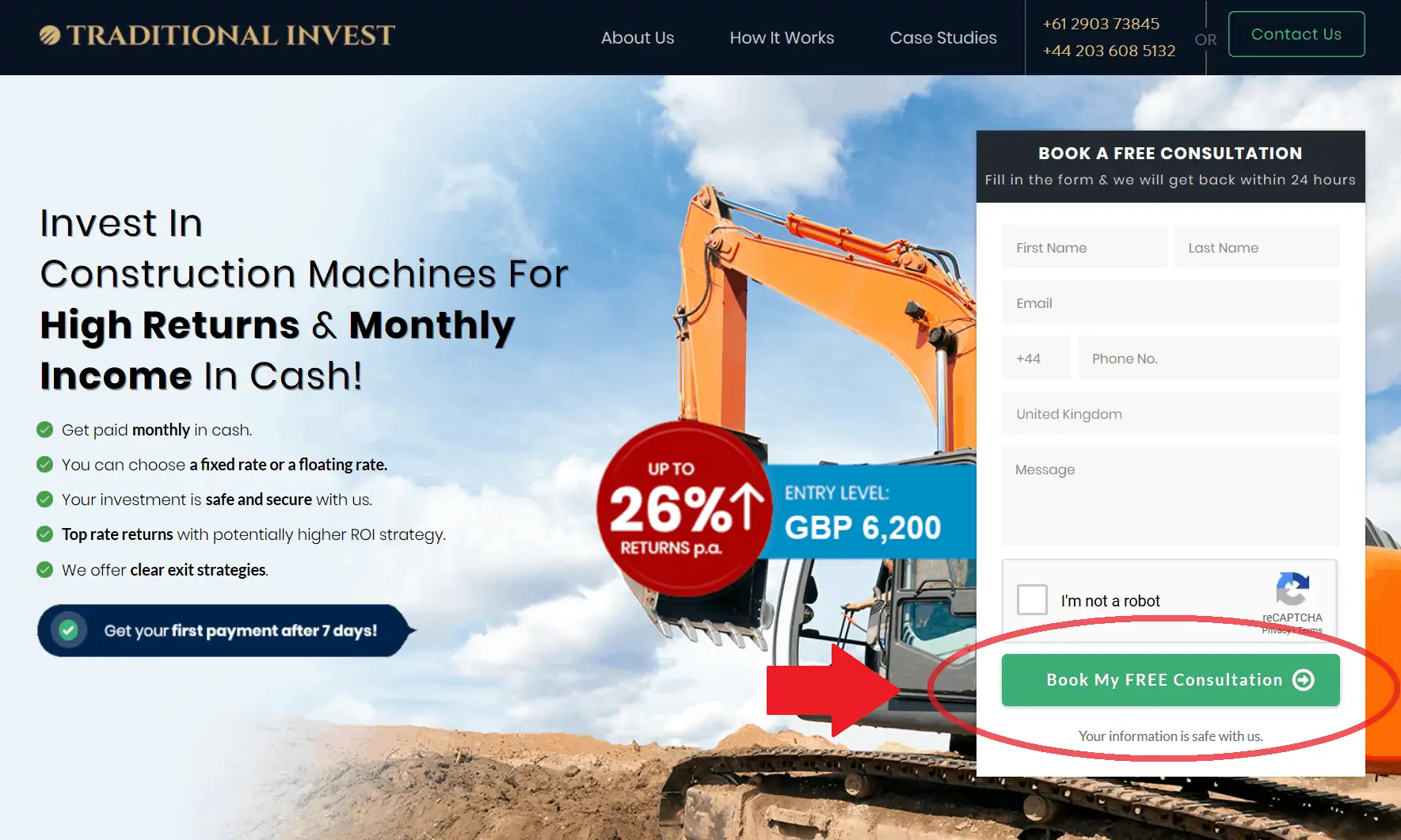
Your CTA button is what decides the success or failure of your landing page and your whole marketing campaign.
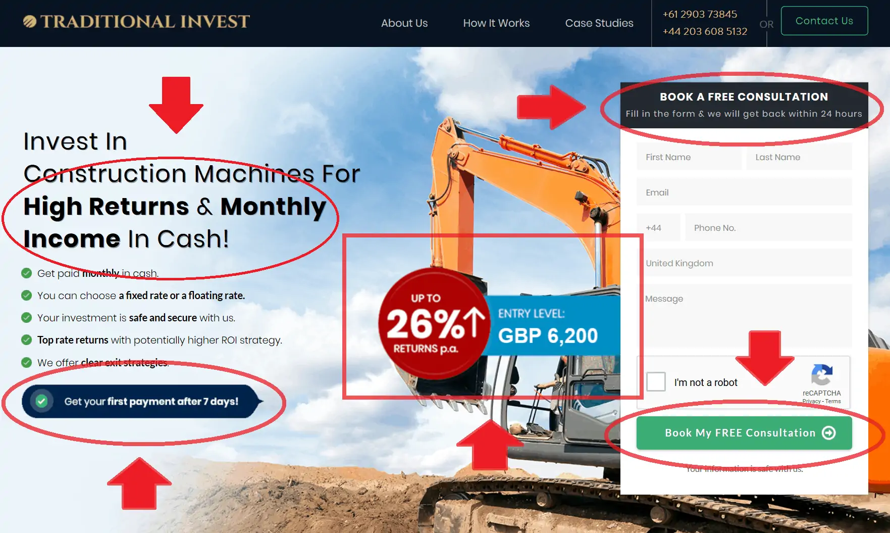
When a user lands on your page, you want to direct their attention to your CTA immediately. That means placing your CTA button above the fold:
However, not every visitor is going to be ready to convert immediately. If a user doesn’t understand your offer, they won’t buy it.
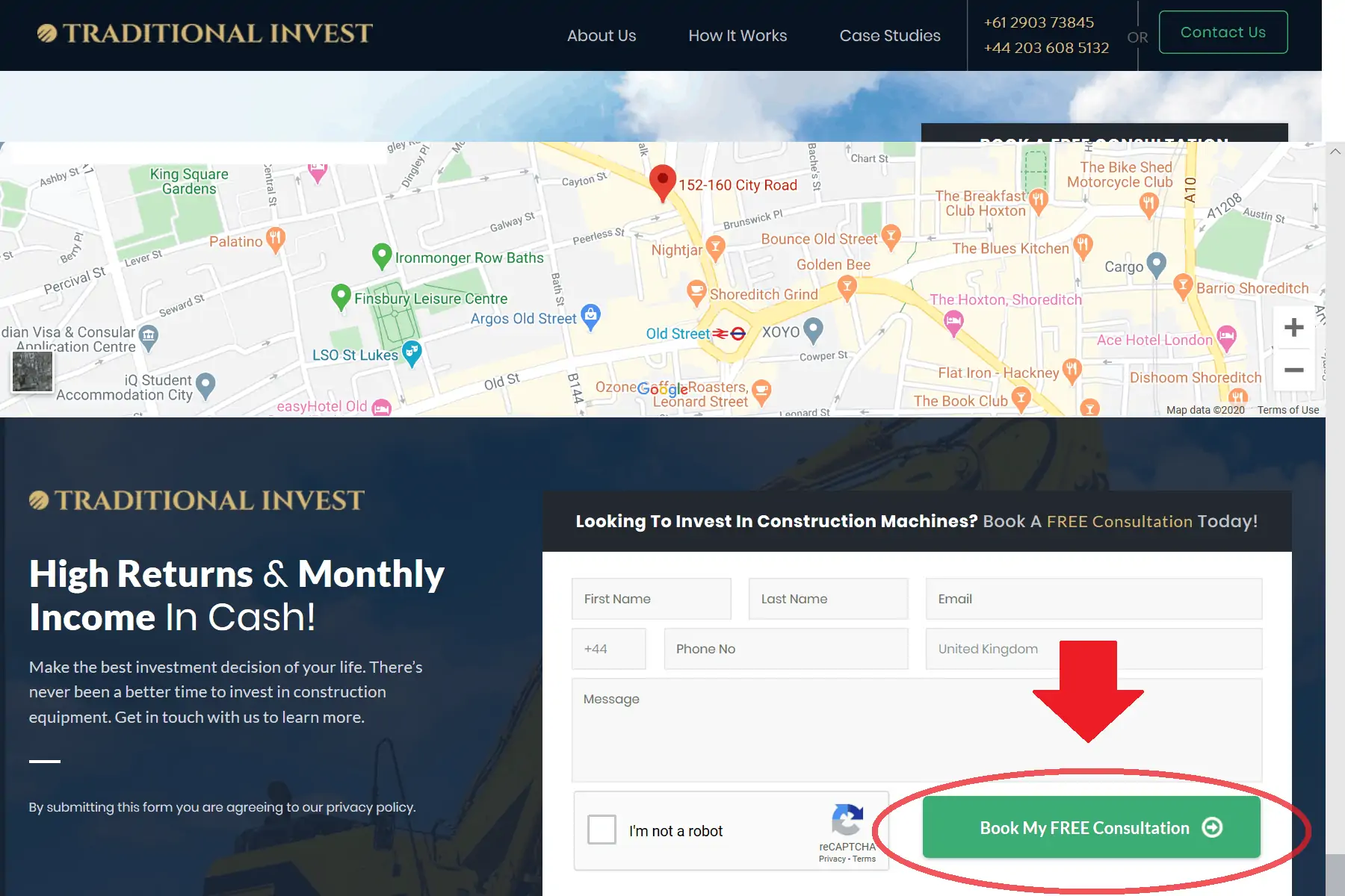
That’s why you should include a second CTA below the fold:
Your landing page should provide all the information a prospect needs. After reading the details, they will arrive at your second CTA more convinced and willing to commit.
Appeal Directly to Your Audience and Their Desires
The vast majority of landing pages rely on generic sales copy that fails to resonate with its target audience. To create a landing page that is compelling to your potential customers, you need to understand why they are visiting your website.
What’s in it for them?
You need to step into the shoes of your audience and determine what it is that they hope to achieve by taking up your offer.
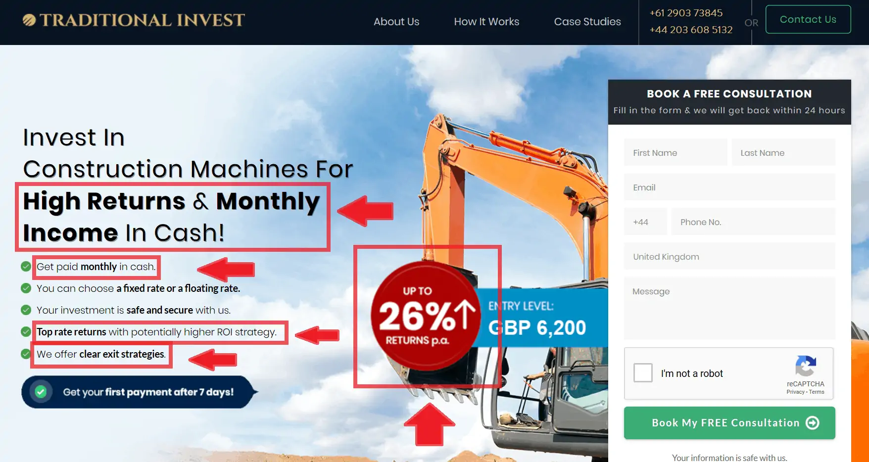
Rather than focusing on the features, you need to put the benefits of your offer front and center of your landing page:
Your above the fold content should make the benefits of your offer clear as soon as a visitor lands on the page.
Use of Power Words
Your choice of language plays a vital role in the success of your landing page. It either compels visitors to take up your offer or fails to capture the imagination and results in a lost sale.
There are certain ‘power words’ that attract attention and provoke a response from the reader.
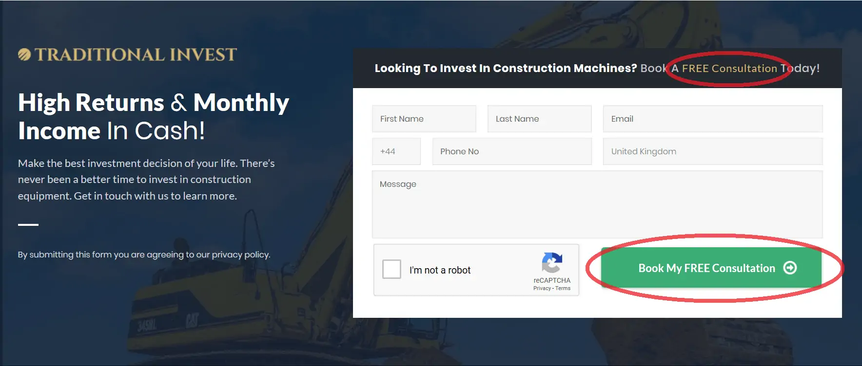
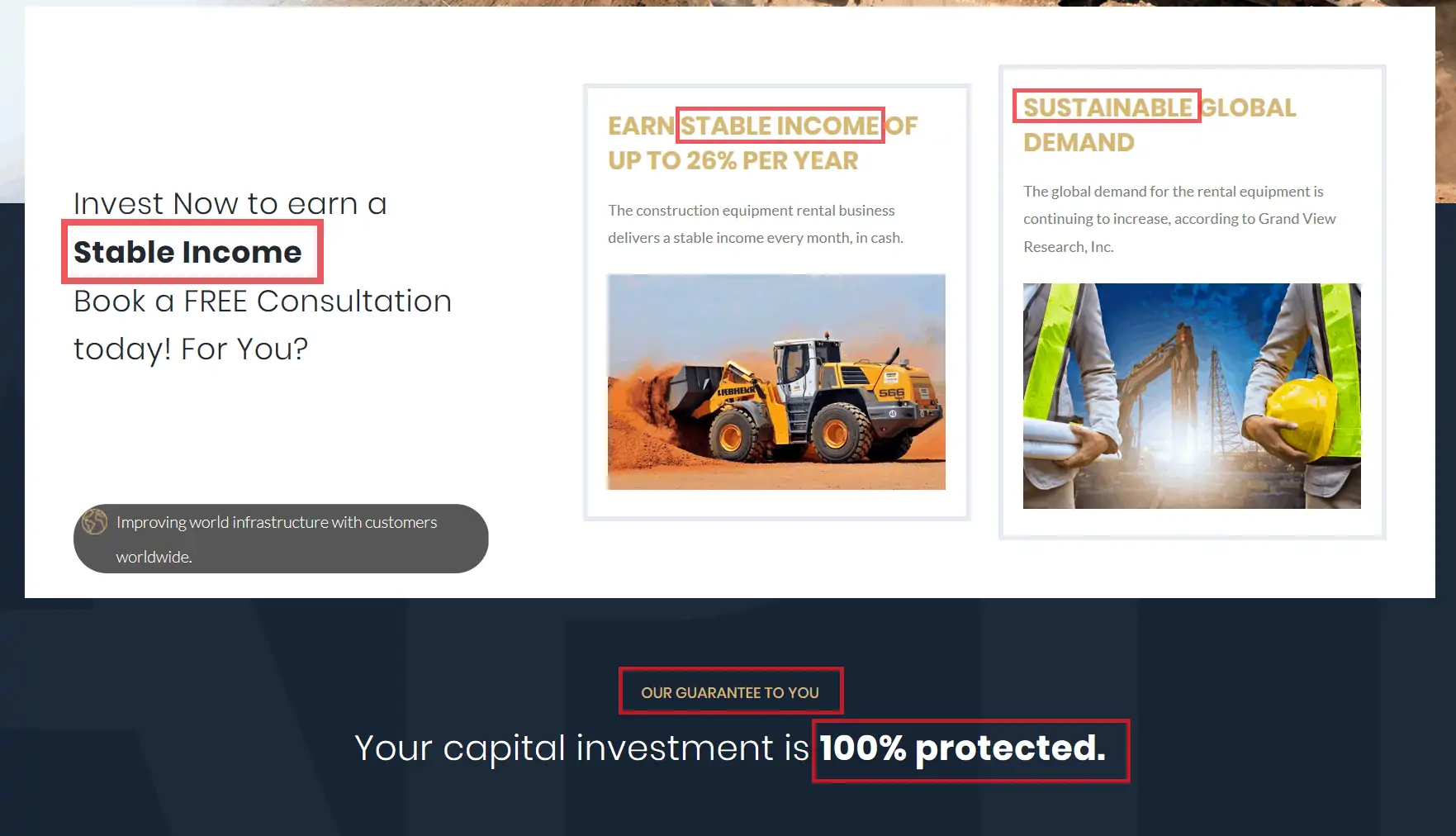
People don’t want to buy products; they want to solve their problems. But they also want to choose the easiest path possible to achieve their goals. In the example below, the power word ‘free’ serves two functions:
It makes the CTA and headline more enticing and eye-catching, but it also helps to overcome any reservations the prospect might be experiencing.
It’s not going to cost anything, so what have I got to lose?
People like to feel validation before they commit to an offer. How can you help people to feel validated?
By including power words that help people to realize they are not the only people taking up your offer.
Words like ‘stable,’ ‘sustainable,’ ‘guarantee’, and ‘protected’ highlight that other people have validated your offer.
You can find a great list of power words in this article from Sumo.com.
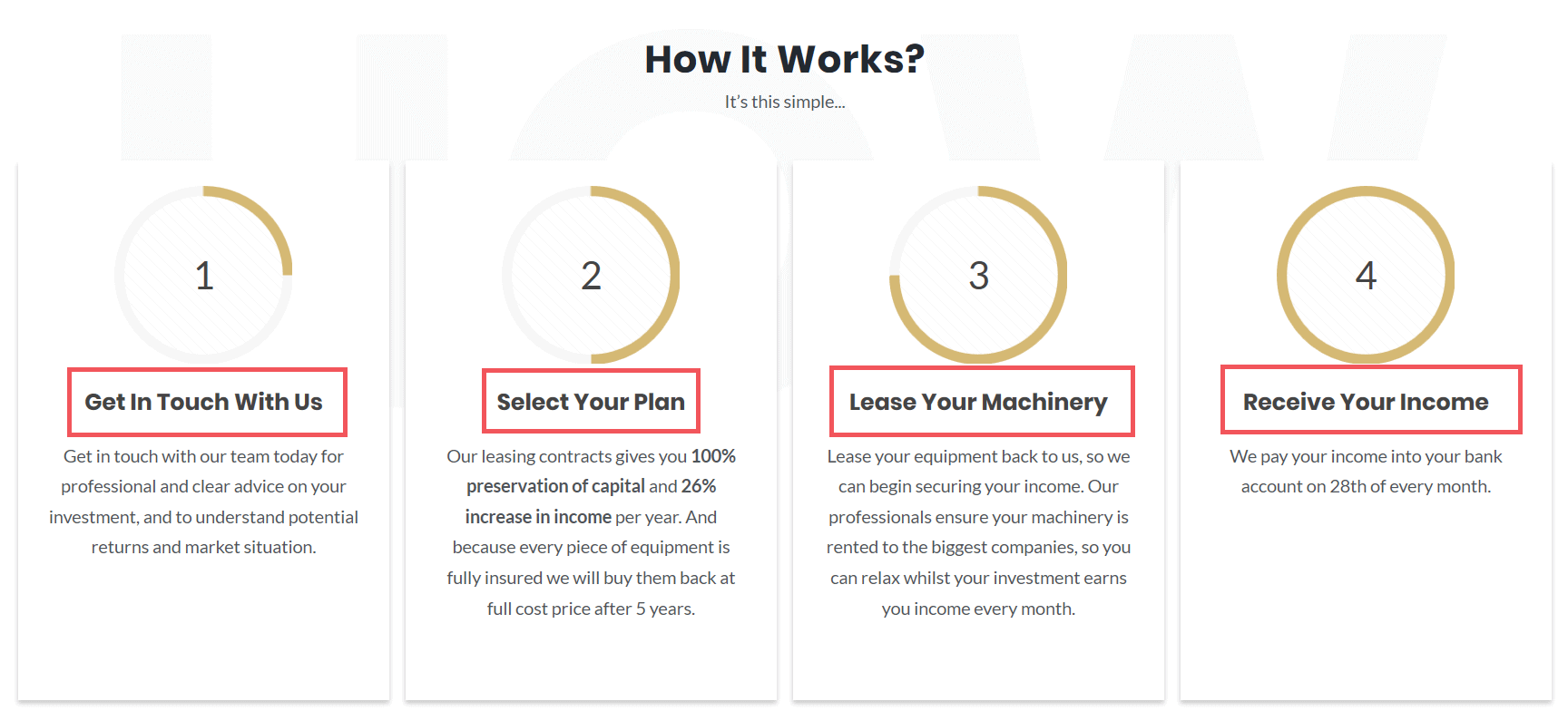
Step-By-Step to Future Pace the Prospect
Before anyone commits to your offer, they will want to know what is going to happen next. You need to make this information readily available on your landing page.
Walk your prospect through each stage of the process until they reach their goal and receive the benefit of your offer:
By painting a picture of the step-by-step process, your potential customer can see themselves progressing to achieve their desired outcome. Creating a vision of a successful future is vital to persuade your prospects to convert and take up your offer.
Testimonials to Back up Your Claims
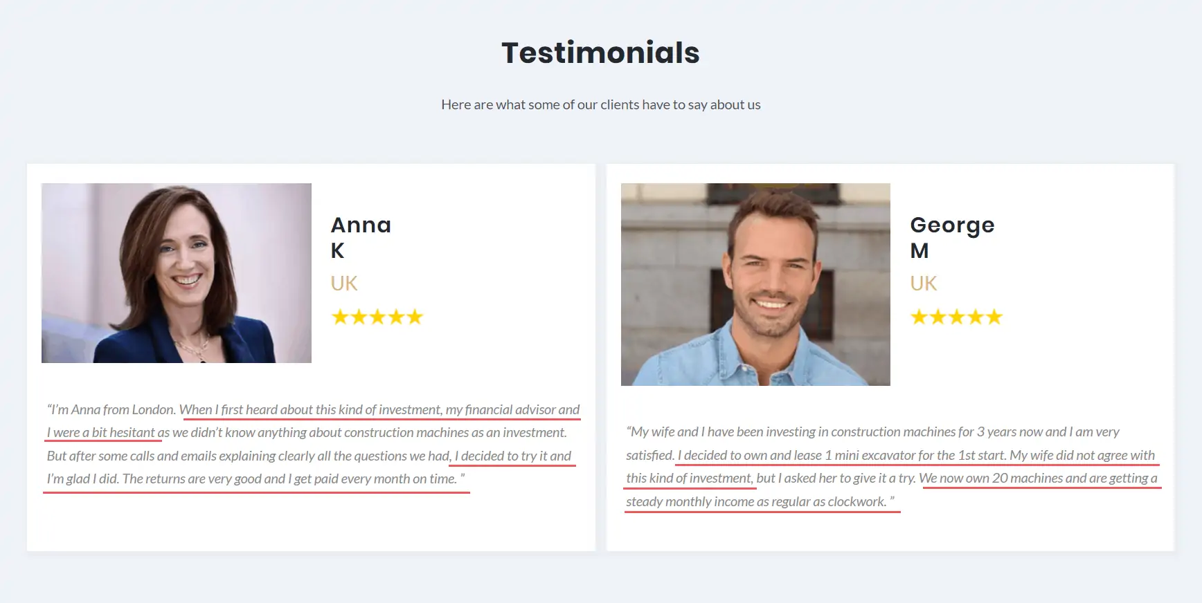
Testimonials are a vital component of your landing page – 84% of people trust online reviews as much as personal recommendations from a friend or family member.
However, don’t just stick random testimonials from your customers on your landing page. You need to be selective, choosing testimonials that are directly related to your offer.
As you can see above, the testimonials highlight the benefits of the landing page offer. They discuss the returns that the offer generated, but also communicate the feelings of apprehension customers encountered before taking up the offer.
This before and after backs up the claim of the offer, but also resonates by showing how other people have already been through the same process and overcome their reservations to achieve their goals.
Images That Pop out and Contrasting Colour
Human beings are visual creatures. We process images 60,000 times faster than we process text. When somebody lands on your page, the first thing that they will see is the colours and images.
You can capitalise on this natural process by using contrasting colours to highlight the most important elements on your landing page. The Traditional Invest landing page utilises colour contrast to direct your attention to the benefits of the offer and the CTA button.
With images being one of the first things your potential customers will see, it’s vital that you have a strategy behind the images you use and how you use them.
The hero image helps to direct attention towards the benefit of the offer, with the bucket of the machine highlighting the potential returns, and also the CTA button on the right-hand side.
Through the use of contrasting colours and strategic image placement, the most important elements are made the focus points of the page.
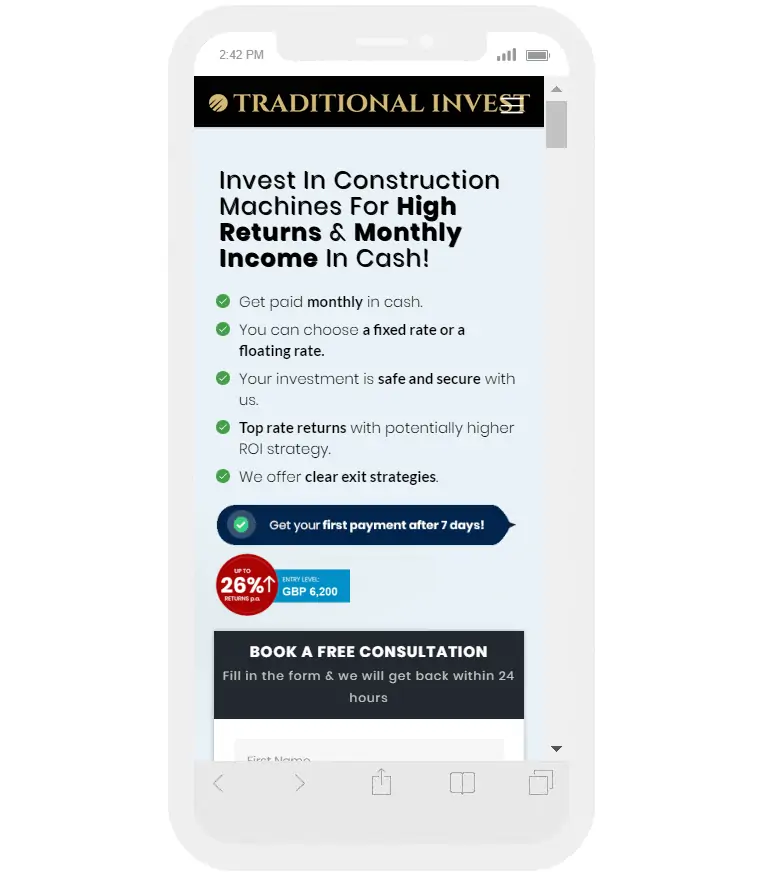
7. The Page Is Mobile Friendly
In 2020, just over half of all internet users will use a mobile or a tablet. That’s why it’s vital to check how your landing page looks on these devices.
As you can see, Traditional Invest’s still looks great.
If you don’t have a table to hand, there are websites and Google Chrome extensions that can help. This one is particularly good as it lets you easily choose various tablets and mobile.
Also, don’t forget to run your page through Google’s Mobile Friendly test. This checks the page is responsive across all mobile devices.
Have You Tested Your Landing Page Recently?
Any PPC campaign can only be as effective as its landing page.
That’s why you should always be testing and comparing yours with the leaders in your field.
Does your landing page include the 7 key ingredients we’ve described above? Are your competitors using them to boost their sales and conversions?
Find out using our handy checklist below.
One Egg’s Landing Page Checklist For 2020:
- CTA’s above & below the fold
- Lead Capture Form
- Compelling Audience-Focused Copy
- Power Words
- Testimonials
- Step-By-Step
- Strategic Images
- Contrasting Colours
- Mobile Friendly

