Email Marketing Insights in 2025 from Neil Patel
Neil Patel recently shared powerful tips on email marketing success—think cleaner lists, smarter personalization, and value-packed content. His key message? Email isn’t dead; it’s evolving.

Companies of all sizes have multiple traffic sources they are investing marketing dollars into. Each traffic source has different metrics that are not comparable. How can we evaluate the overall effectiveness/engagement of our marketing efforts in a simple and condensed way that is easy to understand?
This is a question that many of our clients have asked us. While it is great to investigate traffic sources in a silo, higher level executives usually want an overall picture of performance. This leads us to search for a way to understand the general effectiveness of our marketing reach and engagement
The below outlines a mathematical process for equating & combining multiple traffic sources into a final number. It doesn’t matter what the sources are, they might be online visits, offline store traffic, facebook likes, etc…
The process has 3 essential steps which we will walk through:
If only it were that simple! Here’s an example as to why you can’t simply sum your traffic sources to get an overall picture.
Let’s assume you are the marketing manager for an electronics store. You have 3 traffic sources you are using to measure your overall marketing effectiveness (in a real case you will likely have more than 3):
Here are the numbers for 4 months for each of these metrics. The total score is the sum of the three metrics added for the given month.
| Real Values | Foot Traffic | FB Engagement | Website Sessions | Total Score |
| Jan | 34,000 | 258 | 1,320 | 35,578 |
| Feb | 20,000 | 148 | 1,079 | 21,227 |
| Mar | 22,000 | 404 | 1,175 | 23,579 |
| Apr | 20,000 | 531 | 1,227 | 21,758 |
| May | 19,000 | 70 | 1,263 | 20,333 |
Consider that the total score for March (23,579), is 2,352 points higher than Feb (21,227). It is higher, even though FB engagements and website sessions increased from Feb to March. The reason being that Foot Traffic is a much bigger number. The scale of people coming into the physical store overpowers engagement on facebook and website Sessions. This will always be the case. Therefore simply adding each traffic source together will not give you an accurate picture.
The first thing we need to do is get each traffic source on the same scale. Having each traffic source on the same scale will allow us to compare the traffic sources against each other. Previously we were comparing apples with oranges, now we will turn everything into a type of apple!
We will use a min/max scaler to scale each number between 0 and 1. Where 1 is the highest number in the dataset and 0 the lowest. Every other number (month) will fall within the scale of 0 to 1. The formula for min-max scaling is:

In layman’s terms: for a given feature (eg foot traffic), to a scale a value ‘x’ eg current month. First, deduct the lowest month of foot traffic from the current month. Then divide this by the highest month minus the lowest month. This will give you the current month scaled. Repeat this for each feature.
In excel you can use the following formula:
(A1-MIN($A$1:$A:$12))/(MAX($A$1:$A$12)-MIN($A$1:$A$12))
Where A1 is the current month or ‘x’, and A1:A12 would be the range for feature 1 (foot traffic).
Below I have included the original table or real values and below it the scaled values
| Real Values | Foot Traffic | FB Engagement | Website Sessions |
| Jan | 34,000 | 258 | 1,320 |
| Feb | 20,000 | 148 | 1,079 |
| Mar | 22,000 | 404 | 1,175 |
| Apr | 20,000 | 531 | 1,227 |
| May | 19,000 | 70 | 1,263 |
| Jan Scaled | 1.00 | 0.41 | 1.00 |
| Feb Scaled | 0.07 | 0.17 | 0.00 |
| Mar Scaled | 0.20 | 0.72 | 0.40 |
| Apr Scaled | 0.07 | 1.00 | 0.61 |
| May Scaled | 0.00 | 0.00 | 0.76 |
Remember that we are scaling each traffic source (feature input), which is a column. Looking down the column for ‘Foot Traffic’ we see that January, which was the month with the most Foot traffic has now become a 1, while, May, the lowest month has become a 0. All other months fall somewhere between 1 & 0. The same is true for the other columns. The highest month will be 1 and the lowest will be 0 respective to that column (traffic source).
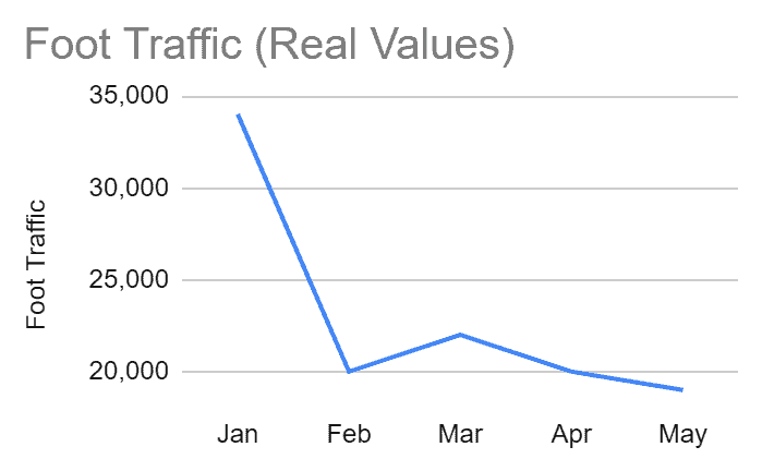
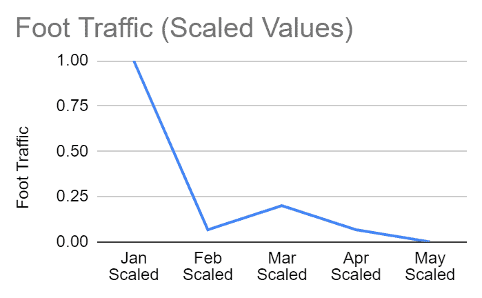
It’s important to note that while we have changed the scaling of each value, the month on month changes within the traffic source (column) are still preserved. The below figures both graph ‘Foot Traffic’, the first graphs the Real original values, while the second figure graphs the values after scaling.


We can see that the changes are preserved. Therefore even after scaling, we are still taking into account how each metric changes over time, we now also have them on a scale where we can compare 2 metrics.
We now have a table of scaled values where each traffic source has a monthly value scaled between 0 and 1. We could add up all of the traffic sources for a given month and get a score for that month which would be meaningful. This score would consider every traffic source of equal value and also take into account monthly changes in performance:
| Scaled | Foot Traffic | FB Engagement | Website Sessions | Total Score |
| Jan Scaled | 1.00 | 0.41 | 1.00 | 2.41 |
| Feb Scaled | 0.07 | 0.17 | 0.00 | 0.24 |
| Mar Scaled | 0.20 | 0.72 | 0.40 | 1.32 |
| Apr Scaled | 0.07 | 1.00 | 0.61 | 1.68 |
| May Scaled | 0.00 | 0.00 | 0.76 | 0.76 |
While the above is already a big improvement on using real values, we can take this up a level by applying weightings. It is likely that you value each traffic source differently and therefore you should choose carefully how you weigh them. That is to say how much value you give them.
For example, we believe that Foot Traffic is worth 50% of the marketing metric and the other 2 traffic sources should comprise the final 50%. Therefore we would apply the following weighting:
To apply these weightings we simply multiply each scaled value in the column by its weighting. The final product below:
| Foot Traffic | FB Engagement | Website Sessions | |
| Applied Weightings | 0.5 | 0.25 | 0.25 |
| Jan Weighted | 0.50 | 0.10 | 0.25 |
| Feb Weighted | 0.03 | 0.04 | 0.00 |
| Mar Weighted | 0.10 | 0.18 | 0.10 |
| Apr Weighted | 0.03 | 0.25 | 0.15 |
| May Weighted | 0.00 | 0.00 | 0.19 |
After weighting each value, the final step in the process is to add up each row (month). Here we are summing each traffic source along the row. The outcome of this is what we call the ‘Marketing Metric’.
| Foot Traffic | FB Engagement | Website Sessions | Marketing Metric | |
| Weightings | 0.5 | 0.25 | 0.25 | 1 |
| Jan Weighted | 0.50 | 0.10 | 0.25 | 0.85 |
| Feb Weighted | 0.03 | 0.04 | 0.00 | 0.08 |
| Mar Weighted | 0.10 | 0.18 | 0.10 | 0.38 |
| Apr Weighted | 0.03 | 0.25 | 0.15 | 0.44 |
| May Weighted | 0.00 | 0.00 | 0.19 | 0.19 |
The final column in this table provides a sum of the scaled and weighted traffic sources for each month. This is the ‘Marketing Metric’.
You will note from the above table that the ‘Marketing Metric’ is also a number between 0 & 1. This is because each scaled value is between 0 & 1 and even though we add the scaled values together along the row, they also have applied weightings between 0 & 1. So the overall marketing metric will also sit between 0 & 1. (For simplicity sake, you might want to multiply the marketing metric by 100, so instead of having a number between 0 & 1 you have a number between 0 and 100, it looks a bit nicer).
The ‘Marketing Metric’ for a given month is not inherently meaningful. Stating that in March we received a score of 0.38, has no meaning whatsoever to anyone. Meaning comes when we compare the Metric between periods. For example, we can say that Jan had the highest marketing metric so it was the best month. Or we could say that the marketing metric improved 375% from February to March.
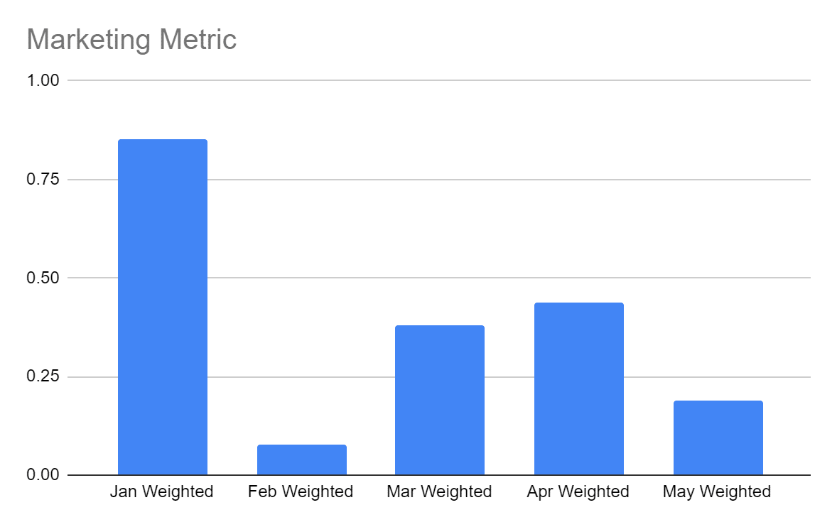
We can see this clearly when we plot the Marketing Metric:

As you can see the MM gives us a clear picture of our monthly performance. We can here identify a strong or weak performing month and then drill down into the comprising traffic sources to try and understand further why performance improved or decreased.
We strongly suggest presenting this too clients using a combination of Google Sheets and Google Data Studio. Presenting the MM over time in a graph like the one above, with subsequent graphs of real values for each traffic source below is a great way to present the overall picture as well as the corresponding input features.
The process outlined above is a form of attribution modelling. We are weighting each traffic source and thereby attributing value to it. However, we have not taken into account combinations of traffic sources and their interactions within the customer journey. We have assumed that each traffic source exists in a silo. This is an overly simplistic view, as we know someone who walks into a store, will likely have visited the website before and possibly also after.
For our purposes, this is OK, because we are using the MM to gain an understanding of engagement. So both the ‘foot traffic’, ‘website visit’ and ‘facebook like’ are all relevant and should be counted towards engagement.
Tools like Google Analytics & Facebook attribution, have attribution modelling tools which help solve the harder problem of how to attribute traffic sources towards a sale. Where each traffic source is given a certain value of the overall sales figure.

Neil Patel recently shared powerful tips on email marketing success—think cleaner lists, smarter personalization, and value-packed content. His key message? Email isn’t dead; it’s evolving.

SEO copywriting: user-focused, keyword-rich content. Optimize URLs, titles, and meta descriptions. Balance search engines and audience needs to boost rankings and drive traffic.

Brand owners can control their Amazon listings and remove unauthorized sellers by enrolling in Brand Registry. This grants priority in content updates, access to A+ content, and tools like Brand Transparency and Project Zero.
Subscribe to receive exclusive industry
insights & updates
Copyright © 2014 – 2025 One Egg. All rights reserved.
Subscribe to receive exclusive industry insights & updates